You’re driving traffic to your e-commerce store. You’ve invested in PPC, SEO, and social media. The analytics show people are landing on your product pages, categories, and even your homepage.
But then they leave.
Quickly. Without buying anything.
This is the silent killer of e-commerce profits: a broken Above the Fold experience.
“Above the fold” refers to the content visible on a webpage before the user scrolls. It’s the first impression, the instant judgment, the make-or-break moment. In e-commerce, it’s not just important; it’s everything. If your above-the-fold content doesn’t instantly captivate, inform, and guide, your expensive traffic is simply walking out the digital door.
In this ultimate guide, we’ll provide an actionable, 5-point UI/UX checklist specifically for e-commerce “above the fold” optimization. Apply these principles, and you’ll transform casual browsers into paying customers, simply by fixing what they see first.
Why “Above the Fold” is the Unsung Hero of E-Commerce Conversions
Think about a physical store. The window display, the entry, the first thing customers see when they walk in – that’s your “above the fold.” If it’s messy, confusing, or uninviting, they’ll turn right around.
Online, this initial impression happens in milliseconds. Users form an opinion incredibly fast. If your e-commerce “above the fold” content fails to:
- Instantly Grab Attention: What is this site about?
- Communicate Value: Why should I stay?
- Build Trust: Is this a legitimate business?
- Guide to Action: What should I do next?
…they’re gone. It doesn’t matter how great your product is or how compelling your reviews are if the user never scrolls down to see them. This precious screen real estate is your most powerful conversion lever.
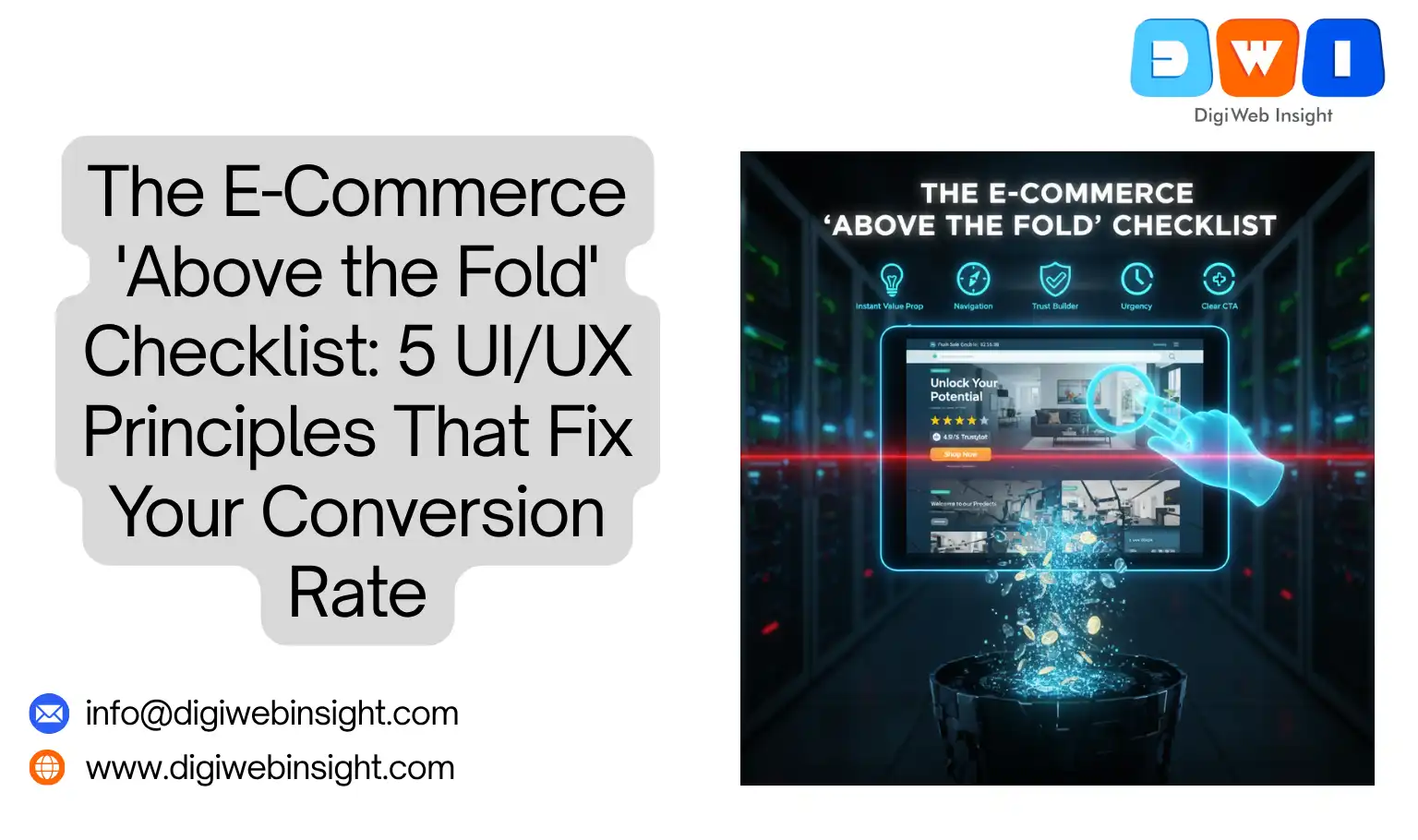
The 5-Point E-Commerce “Above the Fold” UI/UX Checklist
Let’s break down the essential elements you must get right.
1. The Instant Value Proposition: What You Sell & Why I Need It
When a user lands on any page, their first subconscious question is, “Am I in the right place, and what’s in it for me?” Your e-commerce “above the fold” content must answer this immediately, especially on your homepage or category pages.
- What to check:
- Clarity: Is your unique value proposition (UVP) crystal clear in the main headline or hero text? (e.g., “Handmade Leather Goods That Last a Lifetime” vs. “Welcome to Our Store”).
- Relevance: Does the hero image or video immediately convey what you sell? Is it high-quality and appealing?
- Problem/Solution: Does your headline speak to a pain point your product solves? (e.g., “Tired of Flimsy Phone Cases? Discover Our Drop-Proof Design”).
- UI/UX Principles: Clarity, Directness, Visual Hierarchy.
- Fixes:
- Headline Audit: Rewrite your main headlines to be benefit-driven and specific.
- Hero Section Refresh: Ensure your hero image/video is professional, relevant, and directly supports your UVP. A strong hero image can significantly impact bounce rates.
- Sub-Headline: Use a concise sub-headline to elaborate on your primary benefit.
2. The “Wayfinding” GPS: Clear Navigation & Search
A confused user never converts. Your navigation system is the user’s GPS for your entire store. If they can’t figure out where to go “above the fold,” they won’t even try.
- What to check:
- Prominent Navigation: Is your main navigation bar easy to find, read, and understand? Are the categories intuitive?
- Accessible Search: Is a search bar clearly visible and functional? For stores with many products, this is non-negotiable.
- Cart & Account Icons: Are the shopping cart and user account icons easily identifiable and clickable?
- Mobile Experience: Does the navigation collapse gracefully into a hamburger menu on mobile, and is that menu easy to open and use? This is particularly crucial for e-commerce “above the fold” on mobile devices.
- UI/UX Principles: Usability, Intuitiveness, Consistency.
- Fixes:
- Simplify Navigation: Reduce the number of top-level categories if they’re overwhelming. Use mega-menus sparingly.
- Iconography: Ensure cart, account, and search icons are standard and easily recognizable.
- Sticky Header: Implement a sticky header so navigation and search are always accessible as the user scrolls.
3. The Trust Builder: Social Proof & Security Signals
In the age of online scams, trust is paramount. Shoppers need instant reassurance that you’re a legitimate, safe business. These trust signals must be “above the fold.”
- What to check:
- Review Stars/Badges: Do you display aggregate review scores (e.g., 4.9/5 stars) prominently near your product on Product Detail Pages (PDPs) or near your UVP on homepages?
- Security Badges: Are trusted security badges (e.g., McAfee Secure, Norton Secured) visible, especially if you handle sensitive data?
- Payment Logos: Display widely recognized payment method logos (Visa, Mastercard, PayPal) to signal transactional security.
- “As Seen On” / Media Mentions: If applicable, feature logos of reputable publications that have featured your brand.
- UI/UX Principles: Credibility, Reassurance, Transparency.
- Fixes:
- Integrate Review Widgets: Use a review platform (e.g., Yotpo, Trustpilot) to display star ratings dynamically.
- Strategic Placement: Place trust badges subtly in the header, footer, or near your main call-to-action.
- SSL Certificate: Ensure your site uses HTTPS (indicated by a padlock in the browser bar) and that it’s clearly communicated. This is fundamental for e-commerce PDP CRO and overall trust.
4. The Urgency & Scarcity Injector (Ethically!)
While trust signals reassure, urgency and scarcity create motivation. When used ethically, they can significantly boost conversion rates by pushing hesitant buyers to act. These too need to be “above the fold” to be effective.
- What to check:
- Limited-Time Offers: Is your current sale or discount clearly visible with a countdown timer or explicit end date? (e.g., “Flash Sale Ends in 02:30:15”).
- Stock Indicators: Do you show “Low Stock: Only 3 Left!” for products that are genuinely running out?
- Popularity Signals: “150 people bought this in the last 24 hours” or “Trending Product.”
- Free Shipping Threshold: Is your free shipping offer clearly communicated with the minimum spend if applicable?
- UI/UX Principles: Motivation, Action-orientation, Persuasion.
- Fixes:
- Prominent Sale Banners: Use a header bar or hero banner to announce sales.
- Dynamic Stock Alerts: Implement code to display real-time stock levels for low-inventory items.
- Exit-Intent Pop-ups (Carefully!): Use an “above the fold” exit-intent pop-up with a compelling, time-sensitive offer to capture users about to leave.
5. The Obvious Next Step: Clear Call-to-Actions (CTAs)
This is the entire point. What do you want the user to do right now? Your primary Call-to-Action must be unambiguous, prominent, and compelling, sitting squarely “above the fold.”
- What to check:
- Visibility: Is your main CTA (e.g., “Shop Now,” “Add to Cart,” “Get a Quote”) immediately visible without scrolling?
- Clarity: Does the CTA text tell the user exactly what will happen when they click? (e.g., “Add to Cart” vs. “Click Here”).
- Color & Contrast: Does the CTA button stand out from the rest of the page? Is it a unique color that draws the eye?
- Single Focus: On product pages, is there one clear, primary action you want the user to take?
- UI/UX Principles: Guidance, Actionability, Simplicity.
- Fixes:
- Optimize CTA Text: Test different verbs and benefits in your CTA (e.g., “Discover Your Style” vs. “Shop Women’s Apparel”).
- A/B Test Colors: Experiment with CTA button colors to find one that maximizes clicks.
- White Space: Ensure your CTA has enough surrounding white space to make it pop and reduce cognitive load.
- Mobile CTA: On mobile, consider a sticky “Add to Cart” button that remains visible as the user scrolls.
Implementing Your E-Commerce “Above the Fold” Checklist
This isn’t a “set it and forget it” task. Optimizing your e-commerce “above the fold” experience requires ongoing vigilance and testing.
- Audit Your Top Pages: Start with your homepage, top-performing category pages, and your highest-traffic product pages.
- Heatmap Analysis: Use tools like Hotjar or Crazy Egg to see where users are clicking, scrolling, and not clicking “above the fold.” This will visually confirm your problem areas.
- A/B Test, A/B Test, A/B Test: Never guess. Even small changes to headlines, CTAs, or image placements can have a dramatic impact. Use tools like Google Optimize (while it lasts), Optimizely, or VWO.
- Mobile First: Always design and test your “above the fold” experience on mobile first. A majority of your traffic is likely coming from phones.
Conclusion: Your First Impression is Your Best Conversion Tool
The digital storefront is unforgiving. If your e-commerce “above the fold” content doesn’t instantly captivate, inform, and guide, you’re losing customers before they even have a chance to see your amazing products.
By meticulously applying these 5 UI/UX principles – focusing on instant value, clear navigation, trust signals, ethical urgency, and compelling CTAs – you can transform your initial impression into your most powerful conversion tool.
Stop letting valuable traffic slip away. Start optimizing your “above the fold” experience today.
Related Service
- SEO Company USA — Boost national visibility with expert SEO strategies.